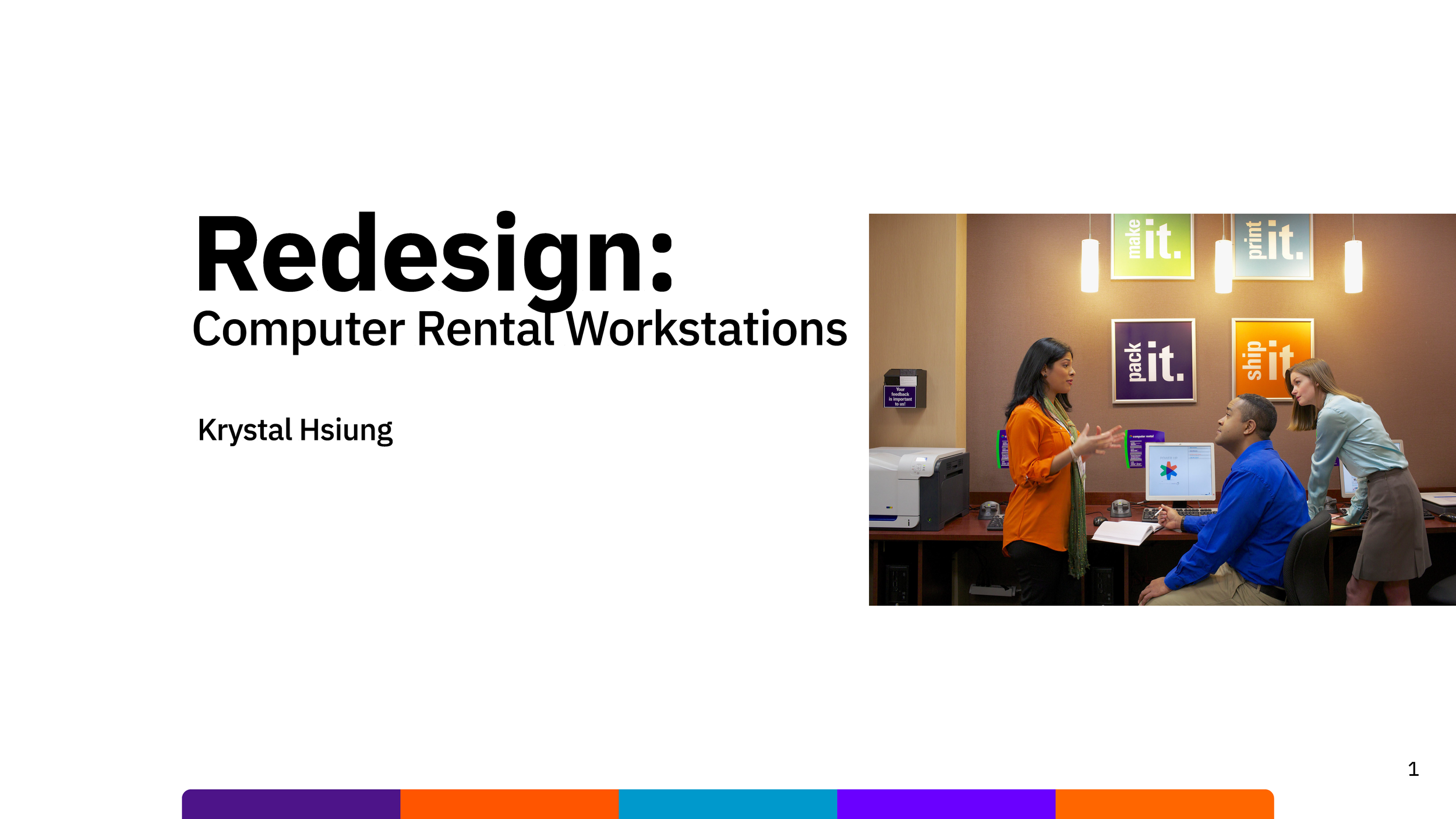
Redesigning Computer REntal Workstation
TLDR
Title: FedEx Office: Redesigning the Self-Service Computer Rental Experience
Role: Lead UX Designer
Tools: Figma, In Store Intercepts
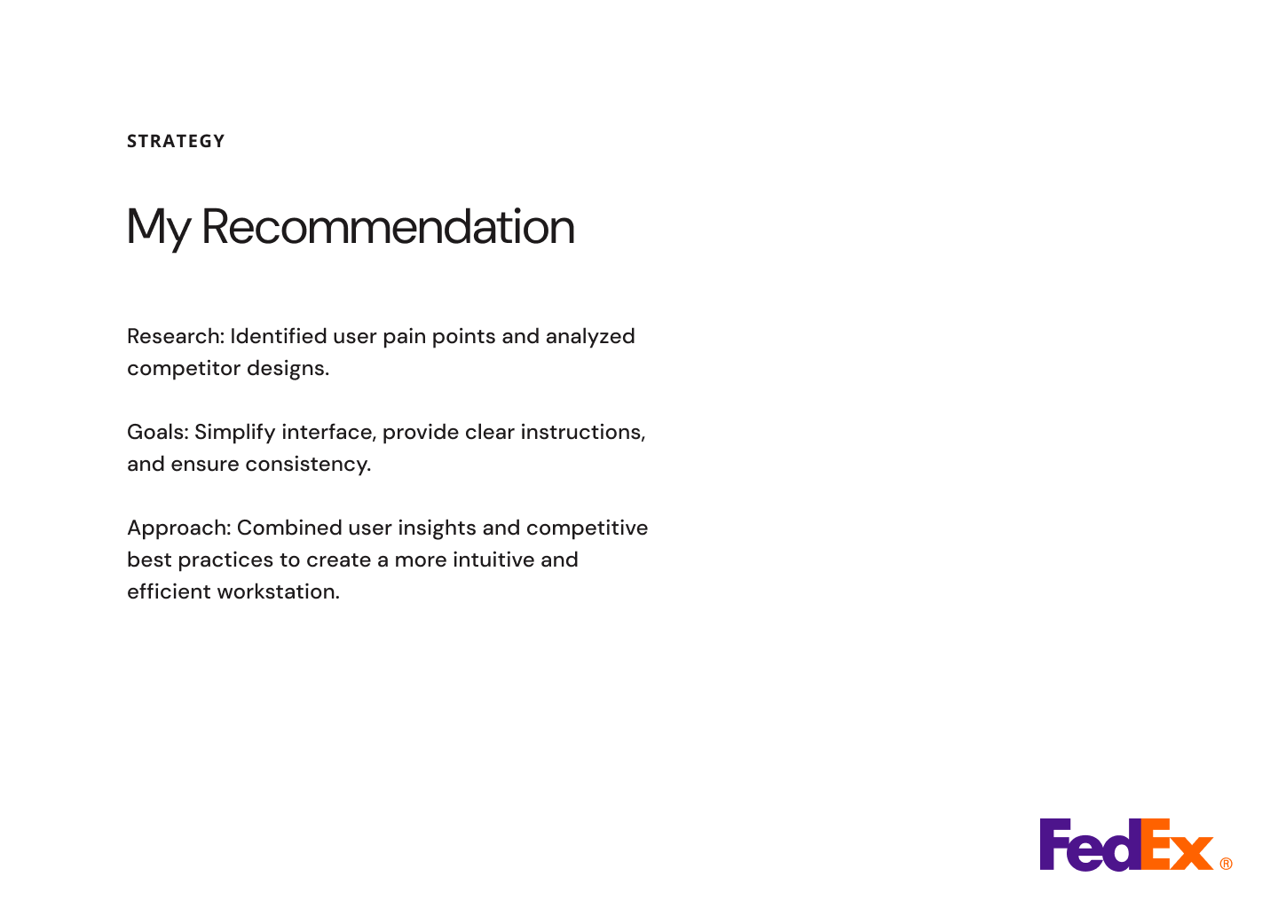
The Goal: Modernize a legacy self-service kiosk to improve task completion rates for printing, shipping, and document editing.
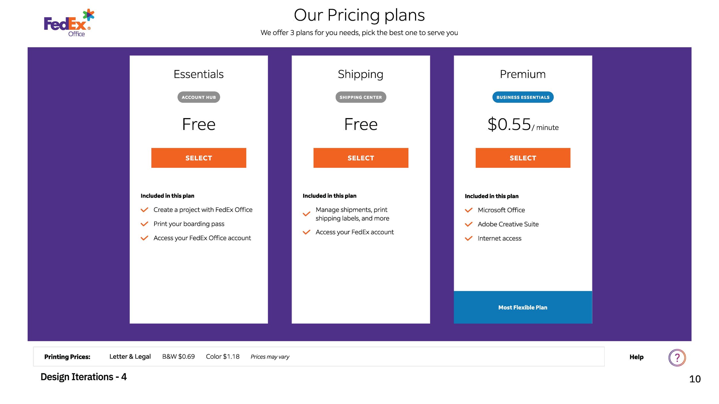
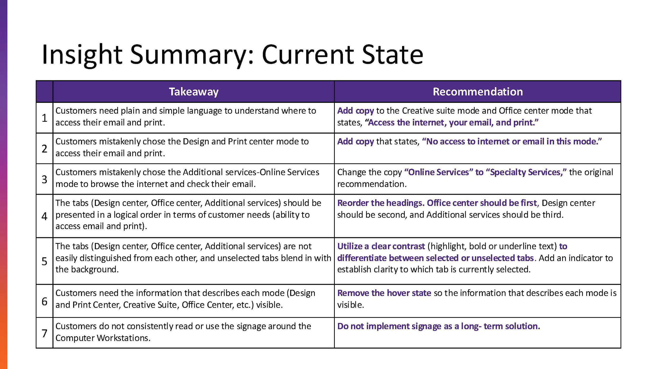
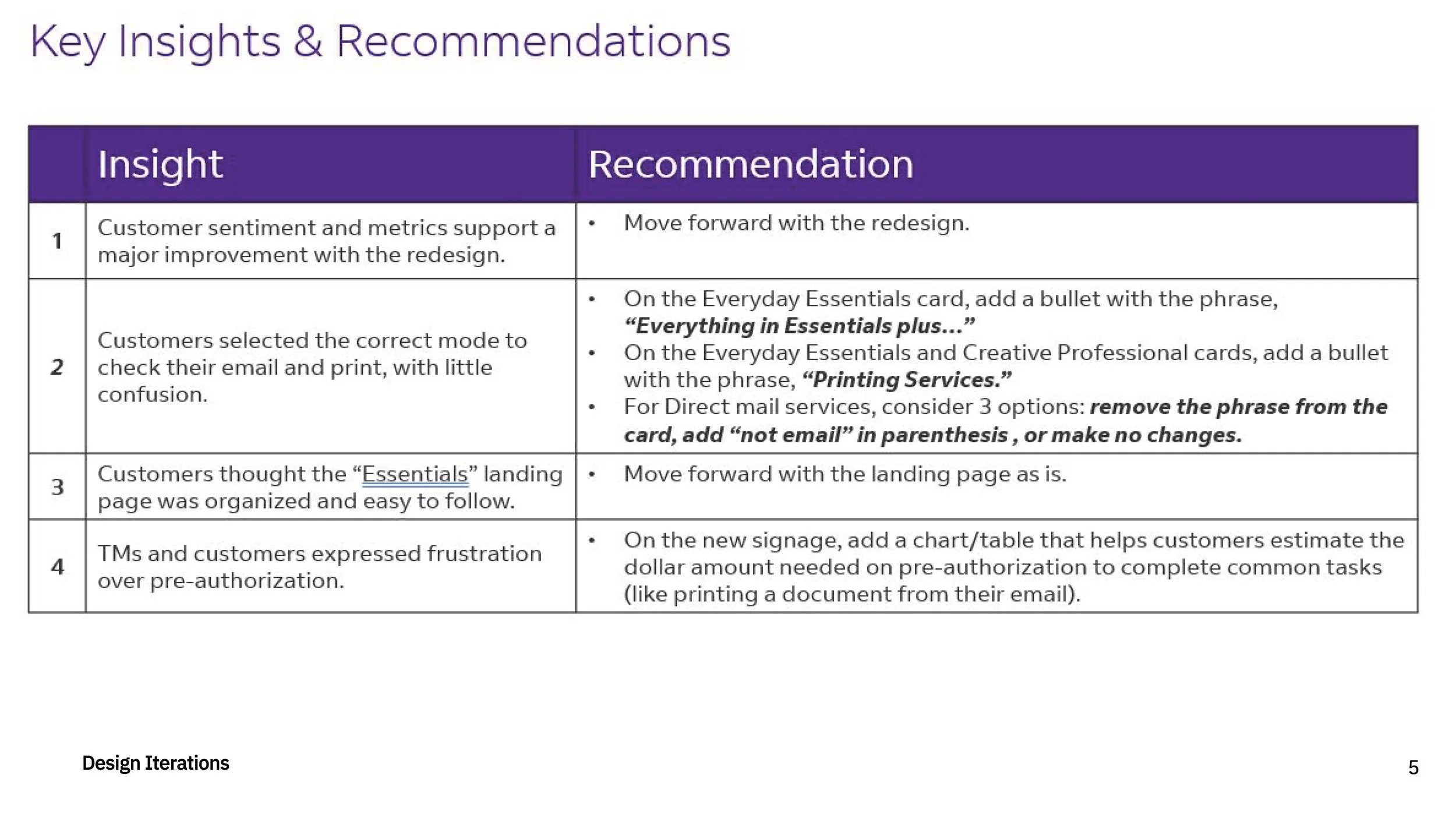
The problem: The existing FedEx Computer Rental workstation featured an outdated interface with high friction points. Users frequently struggled with complex login flows, unclear pricing structures, and a fragmented navigation system that led to high drop-off rates and increased dependency on in-store team members for assistance.
PROJECT SUMMARY VIDEO
Case Study: FedEx Office Computer Rental Redesign
Overview
The FedEx Office Computer Rental workstation is a critical self-service touchpoint for customers needing to print, edit, and ship documents. However, the legacy interface was plagued by high friction, confusing navigation, and a dated visual language that led to frequent session abandonment and high dependency on in-store staff.
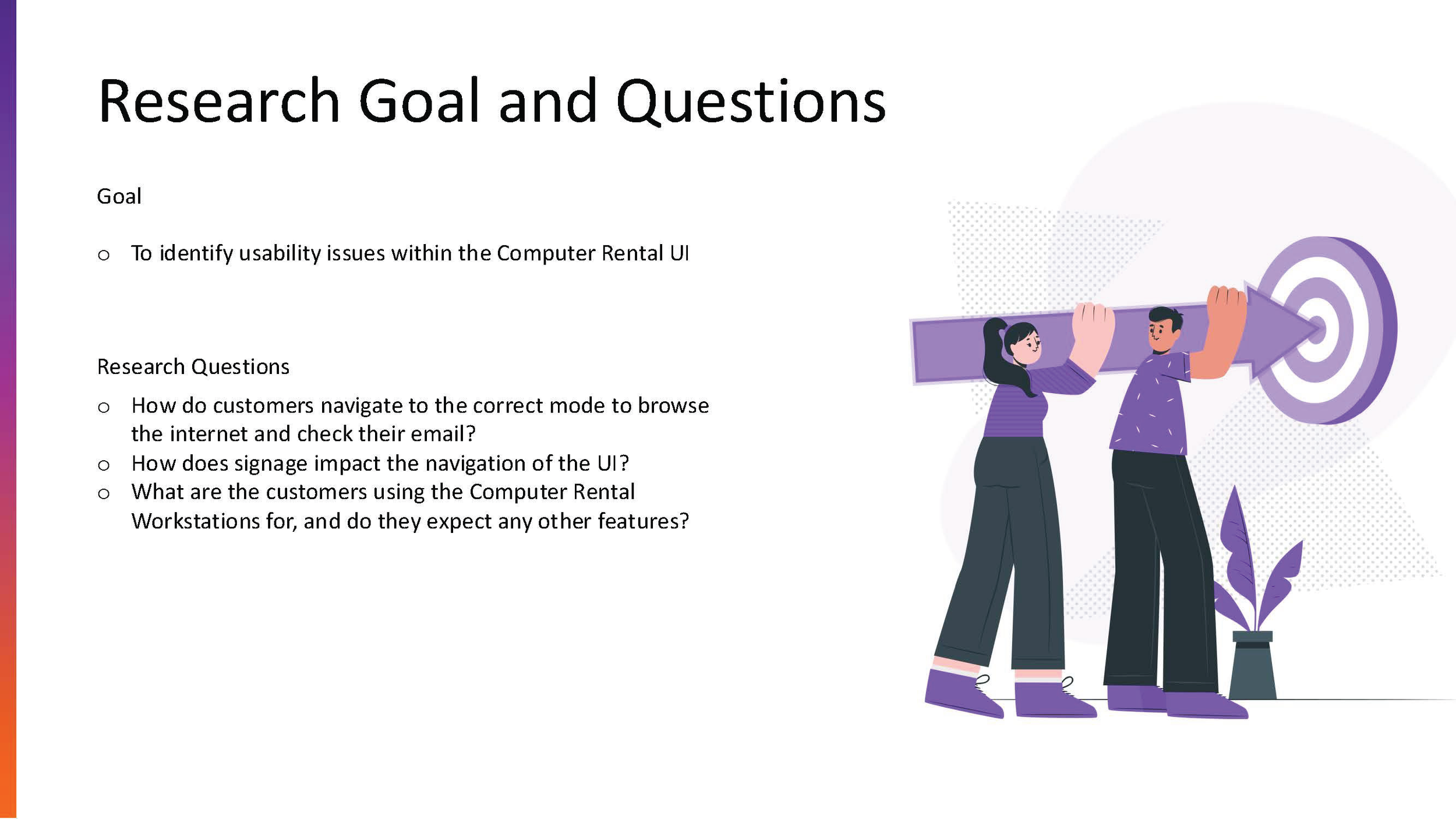
The Challenge
The primary goal was to modernize the digital experience to increase user autonomy and reduce the "time-to-task" for core activities like document retrieval and printing.
Key Pain Points:
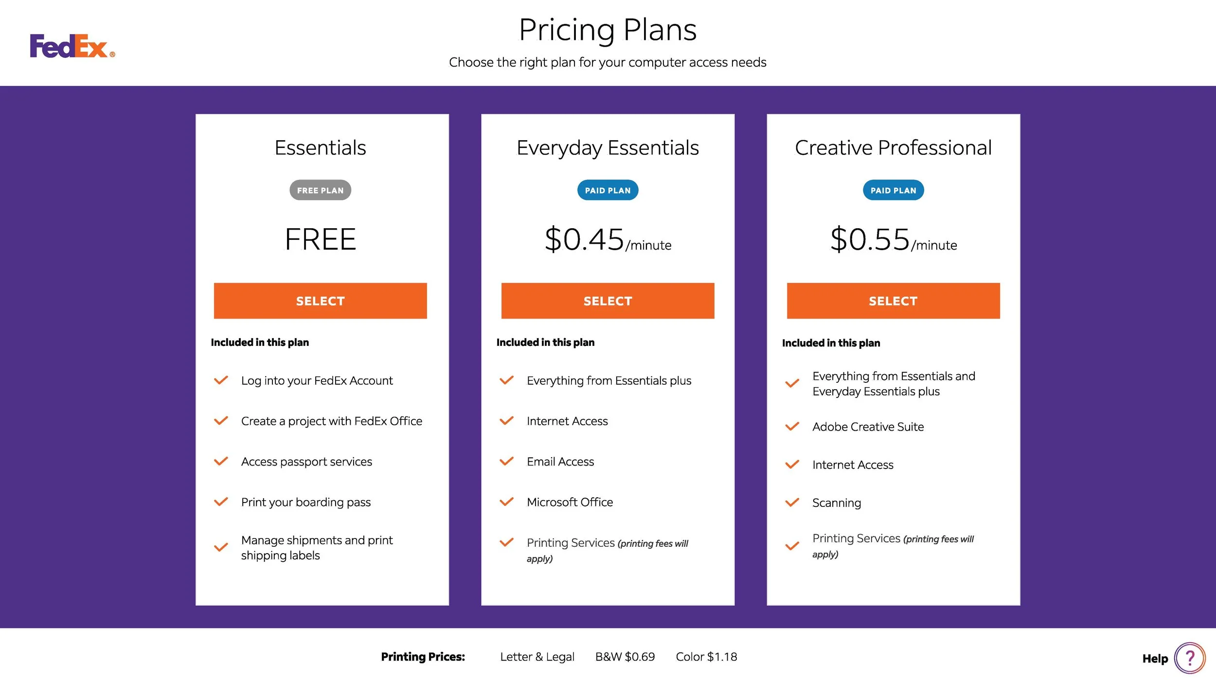
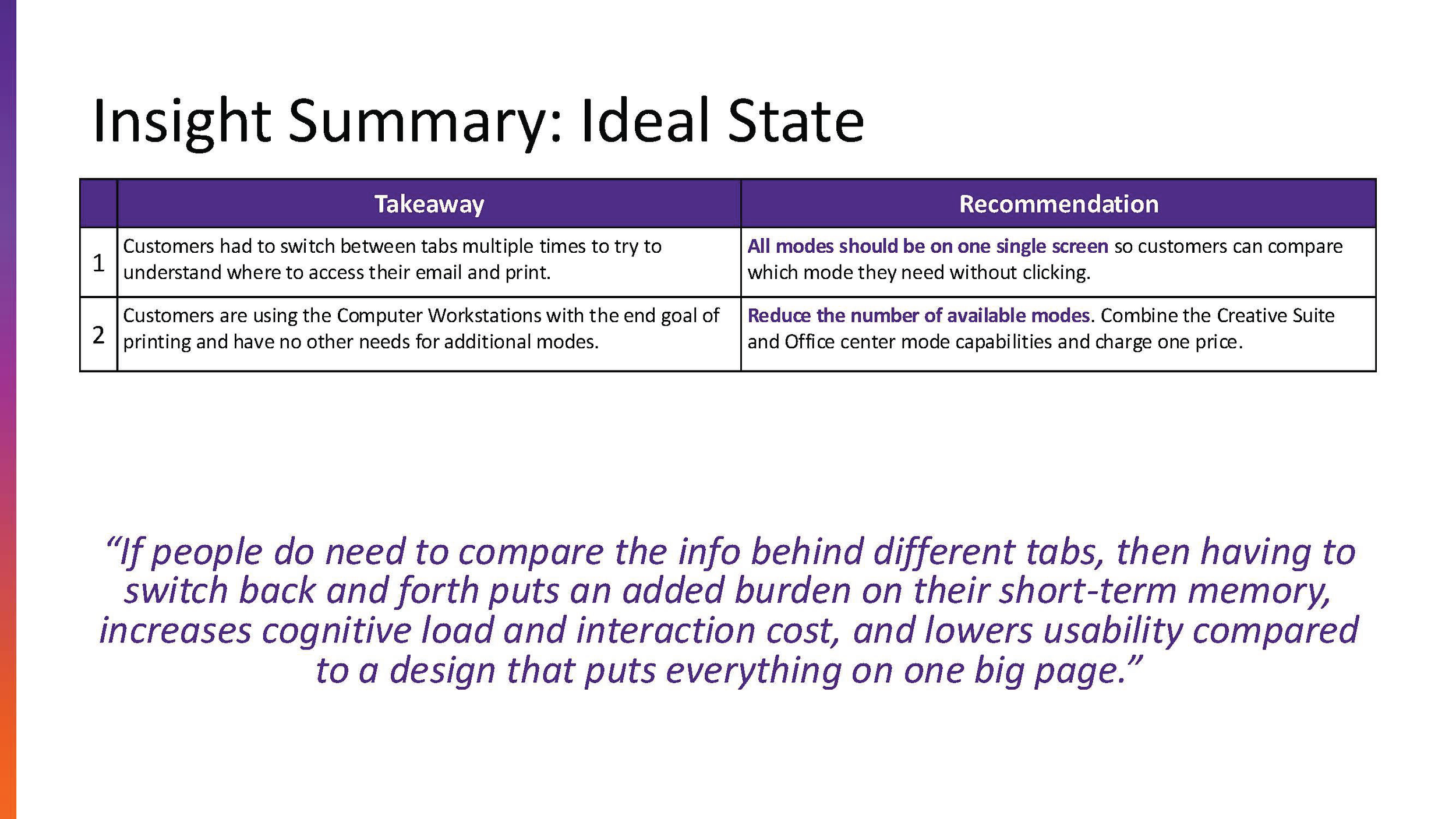
Cognitive Overload: Users felt overwhelmed by cluttered menus and unclear pricing.
Authentication Friction: Complex login flows prevented quick "guest" access.
Physical Context: Designing for high-traffic retail environments required high-contrast, touch-friendly interfaces.
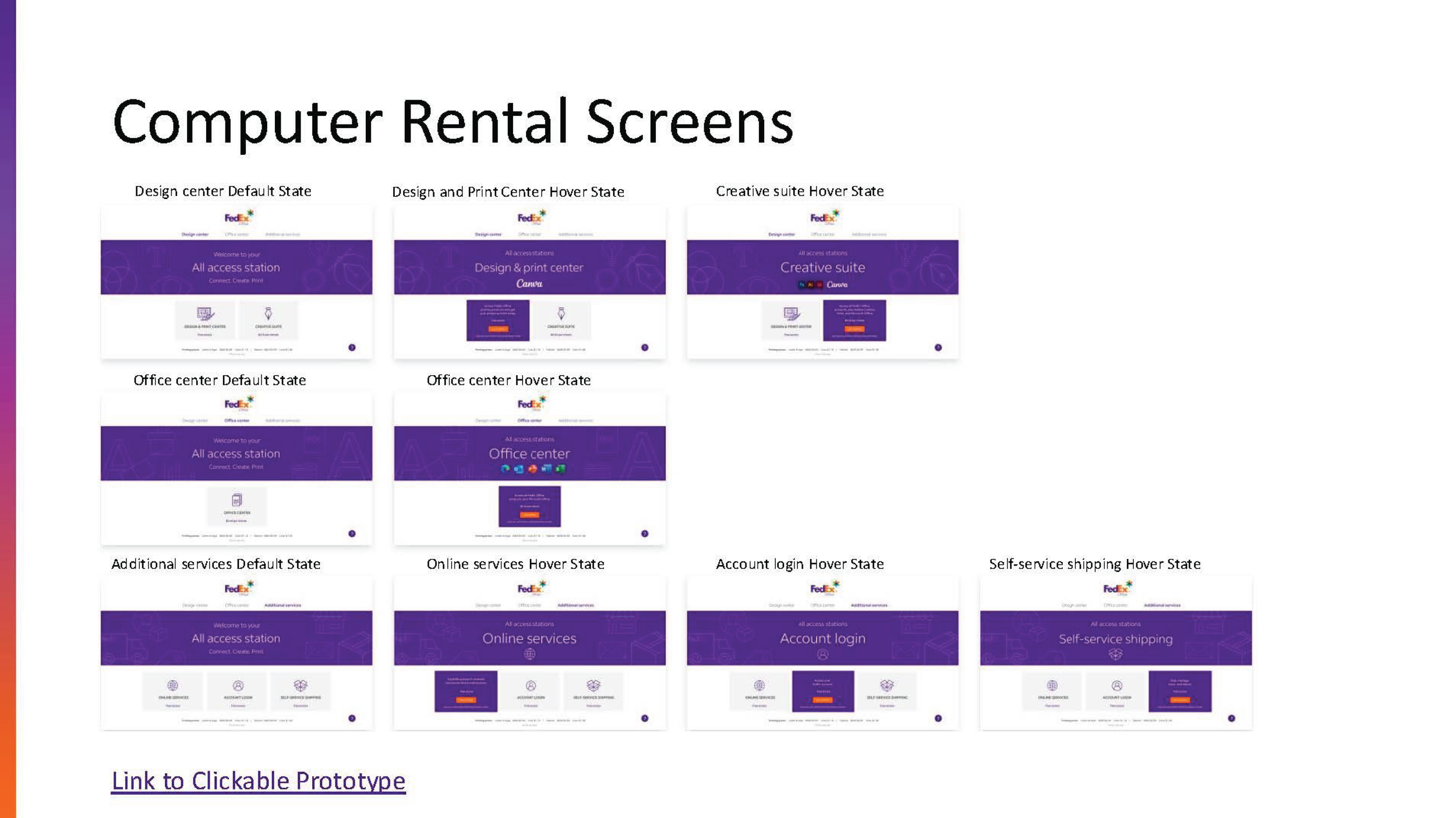
The Solution
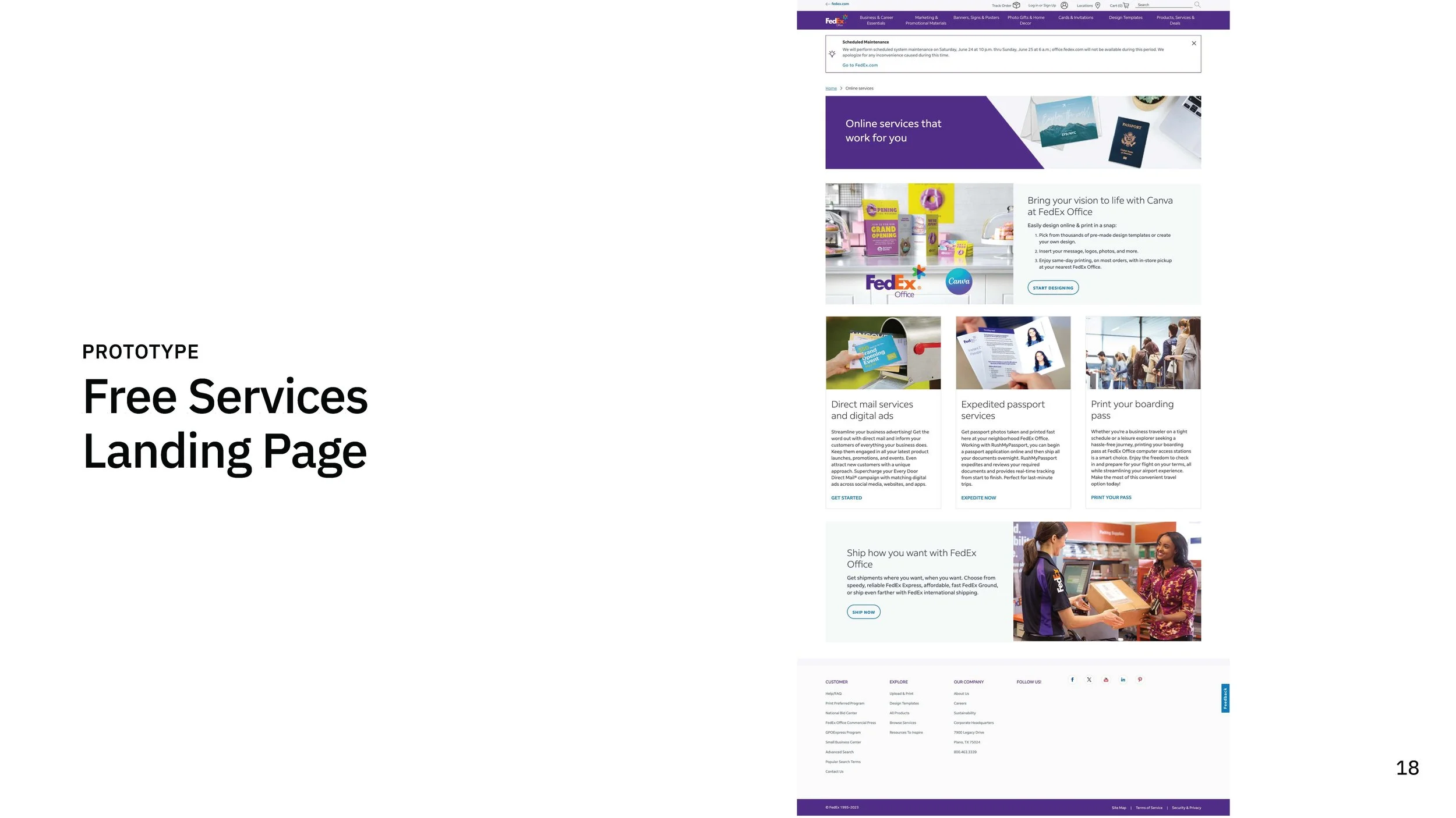
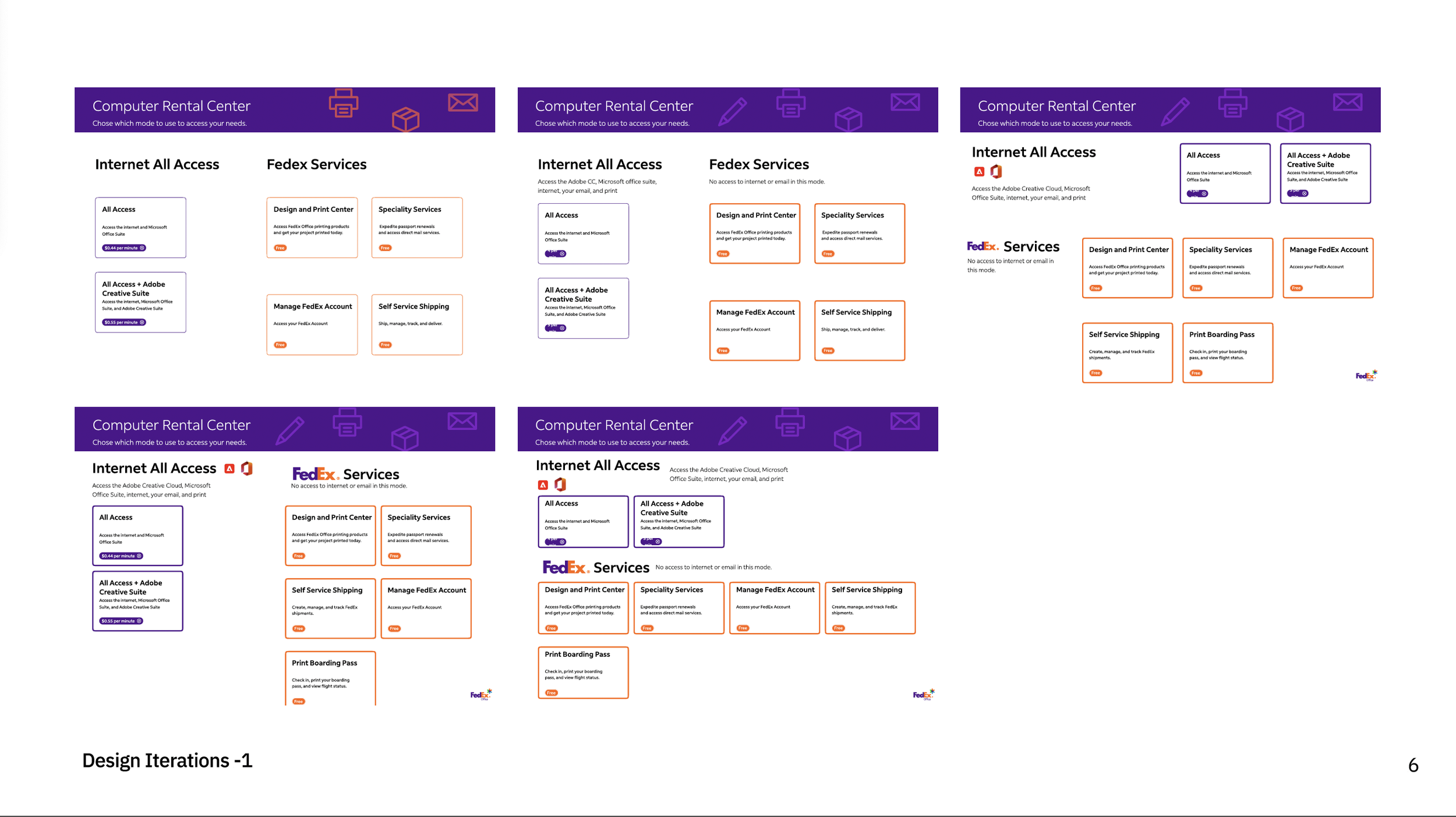
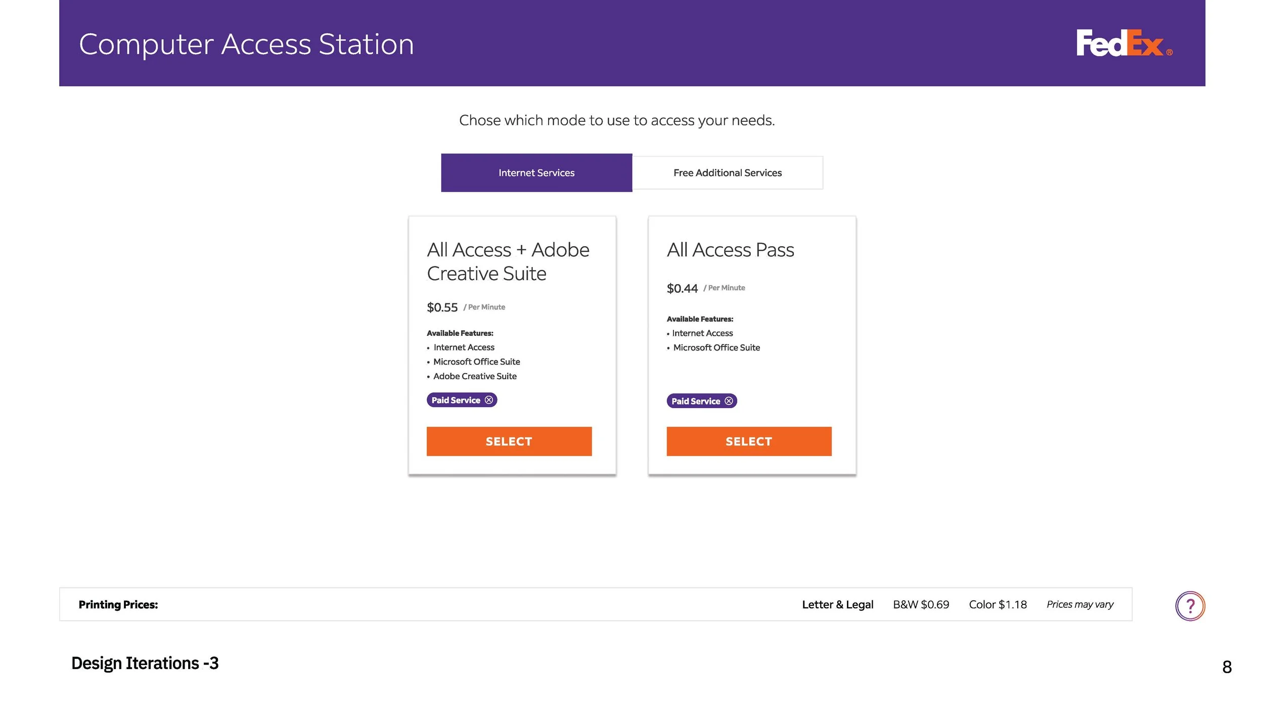
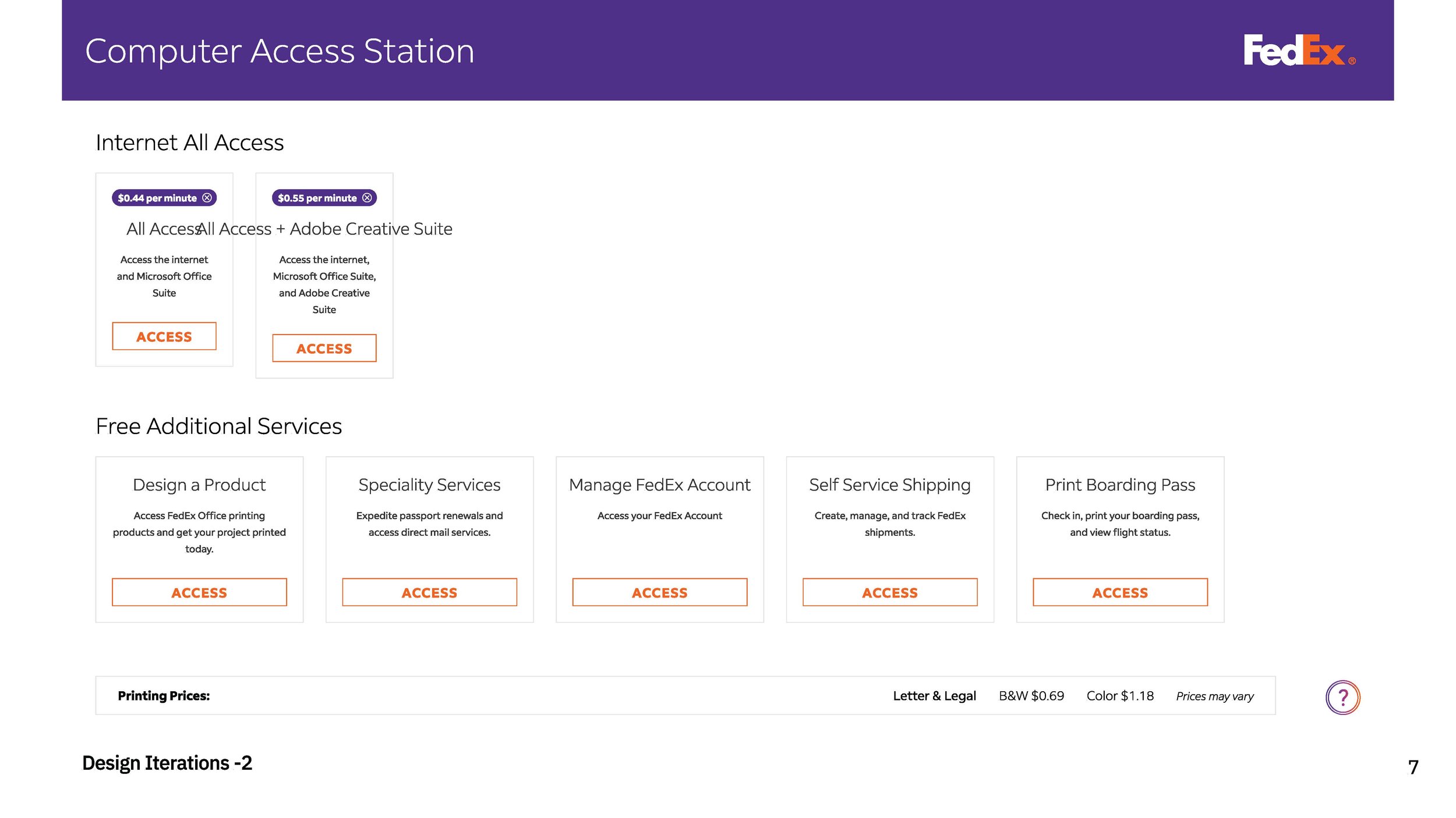
I led the UX redesign by transitioning from a "system-centric" model to a "task-first" architecture. By prioritizing the user’s intent (Print, Design, or Ship) right from the landing screen, we eliminated unnecessary decision-making steps.
Design Improvements:
Streamlined Onboarding: Reduced the guest checkout flow by 40% to cater to "in-and-out" customers.
Visual Hierarchy: Implemented a bold, FedEx-branded design system with large touch targets (44x44px minimum) for improved accessibility.
Real-time Feedback: Integrated a persistent session timer and cost-tracker to provide users with transparency and reduce "bill shock."
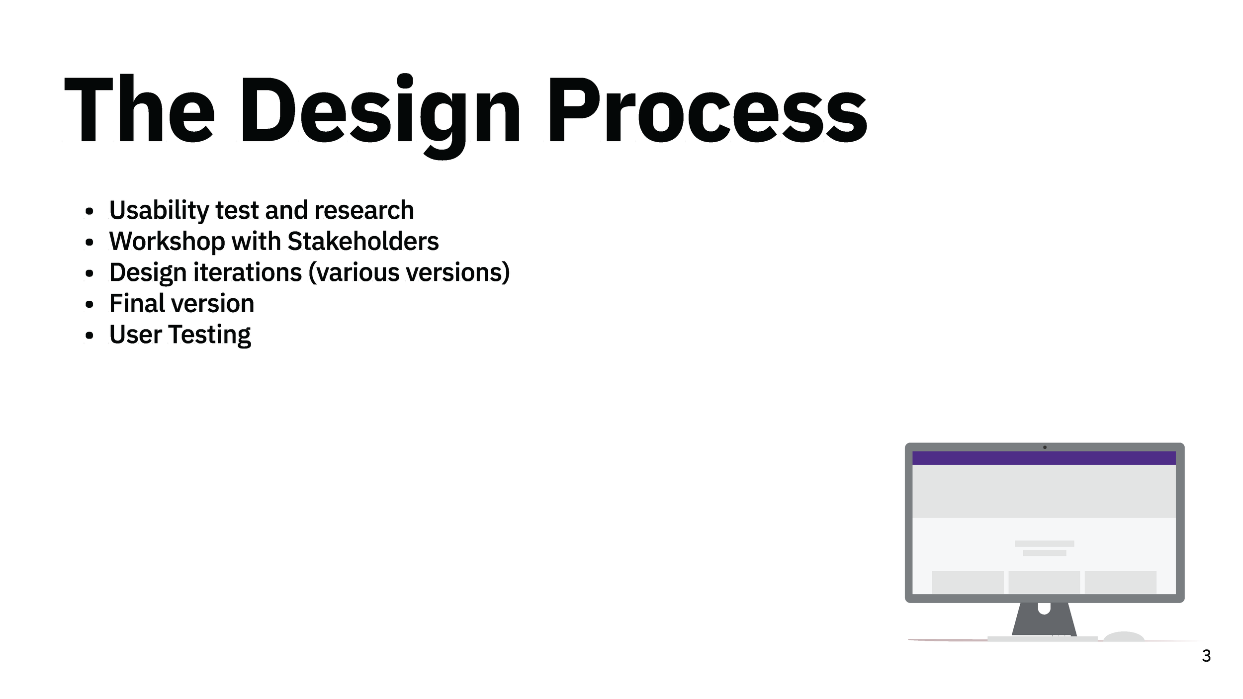
The Process
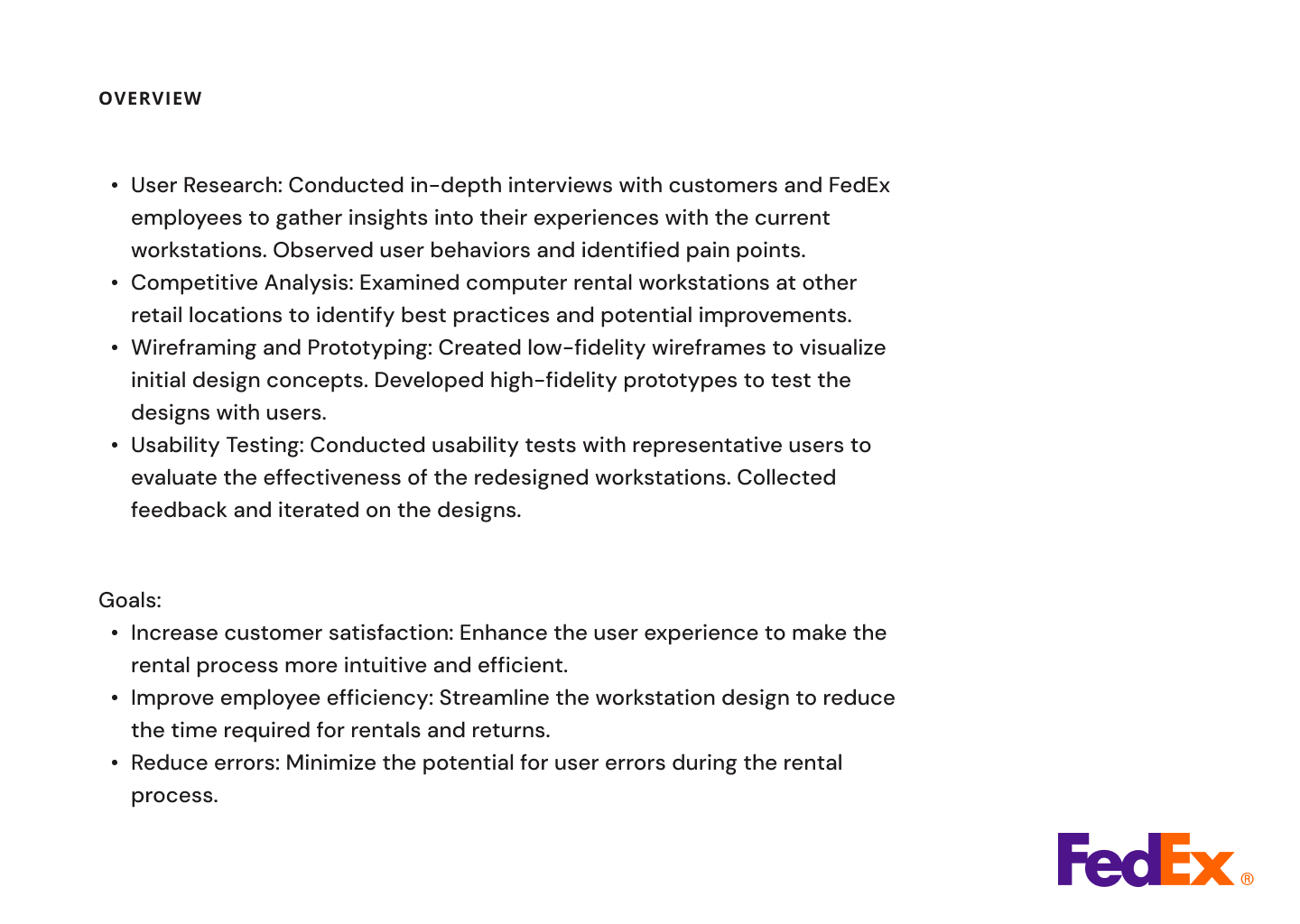
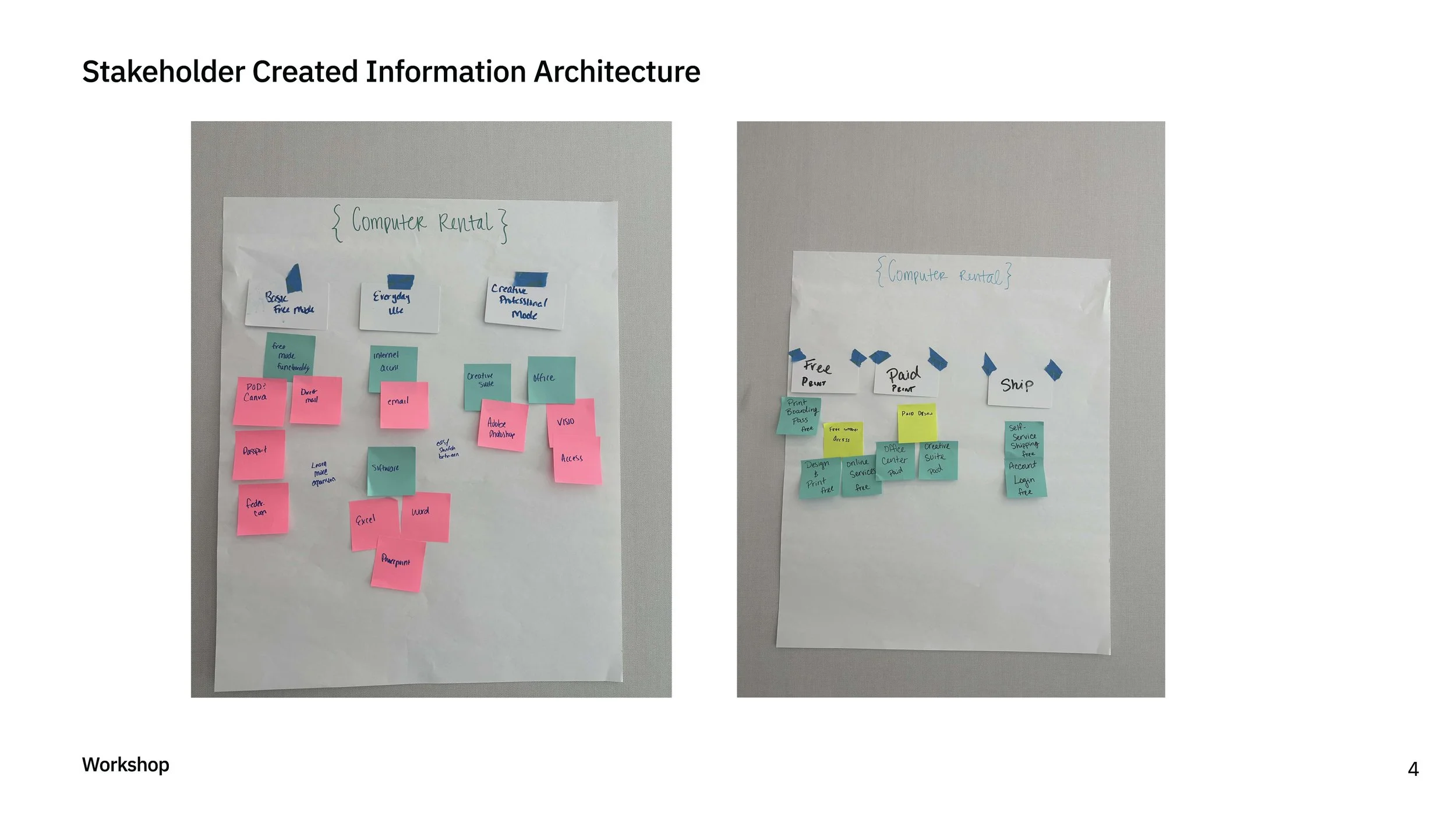
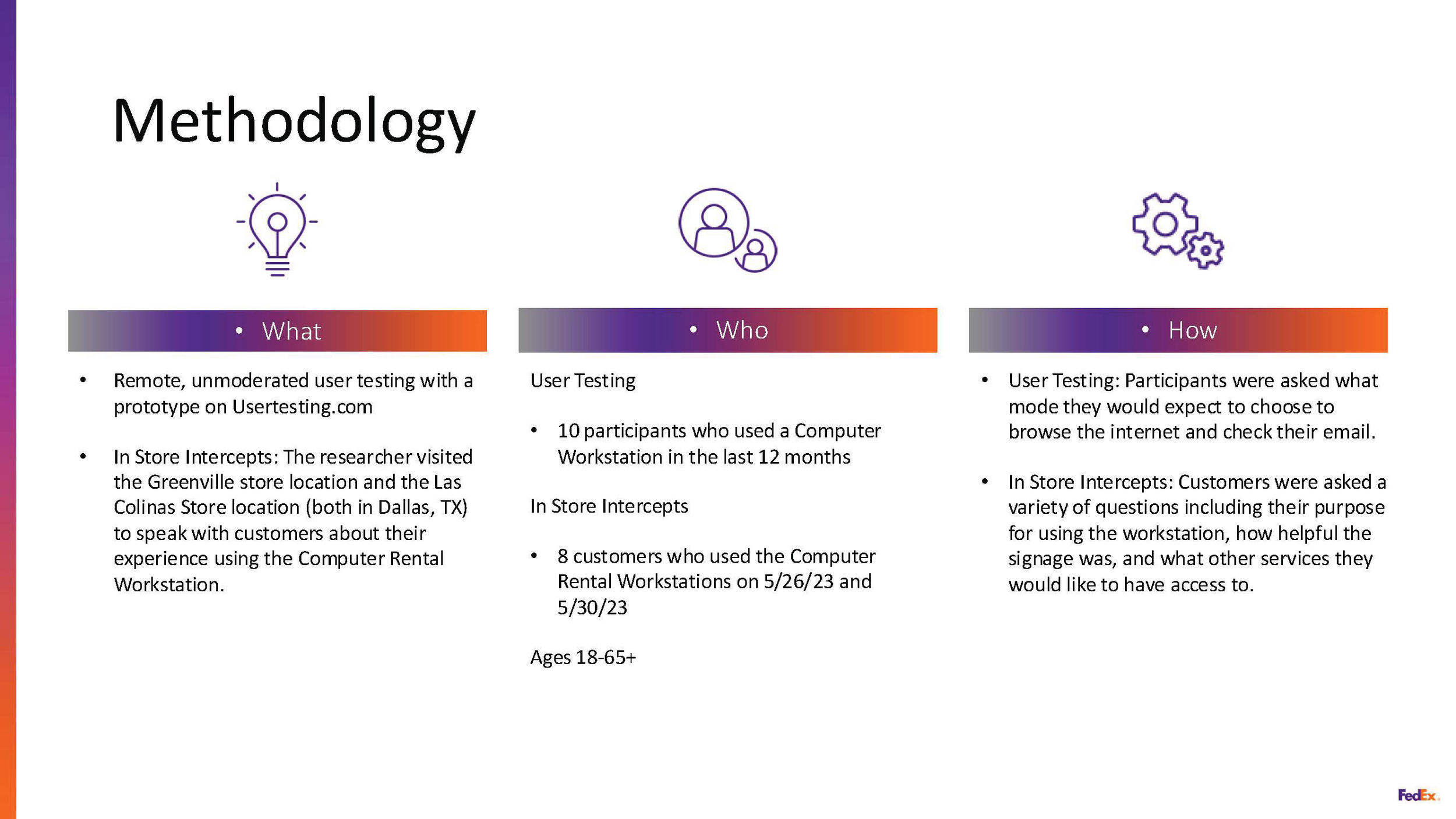
Discovery: Conducted stakeholder interviews and on-site observations to identify where users were getting "stuck."
Definition: Created user personas ranging from the "Hustling Freelancer" to the "Occasional Shipper."
Ideation: Developed low-fidelity wireframes to test navigation logic before moving into high-fidelity UI.
Validation: Iterated on designs based on feedback regarding button placement and readability under harsh retail lighting.
Impact & Results
Efficiency: Improved average task completion time by 91%.
Autonomy: Noted a 70% decrease in customers requesting associate intervention.
Accessibility: Achieved full WCAG 2.1 compliance, ensuring a better experience for users with visual impairments.
SLIDES

IN PRODUCTION